
We are passionate about cheerful branding. However, we love to design classy and refined brands too. That’s why we’re super excited to show you the final result of The Marquee Hotel.
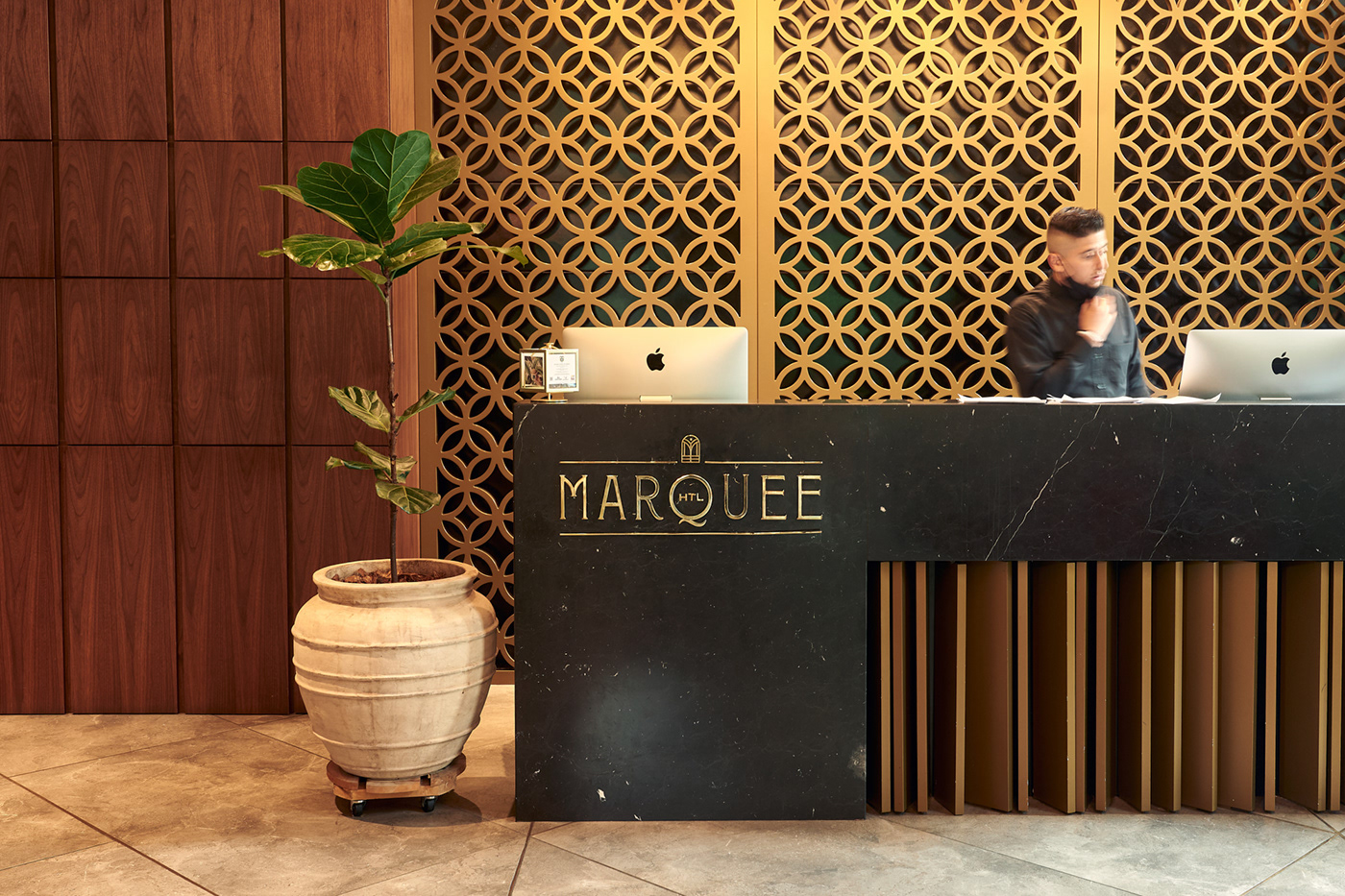
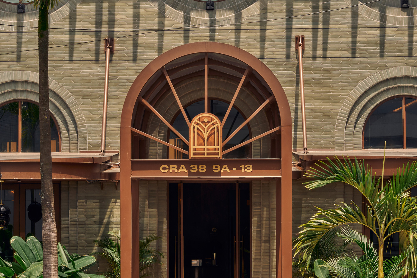
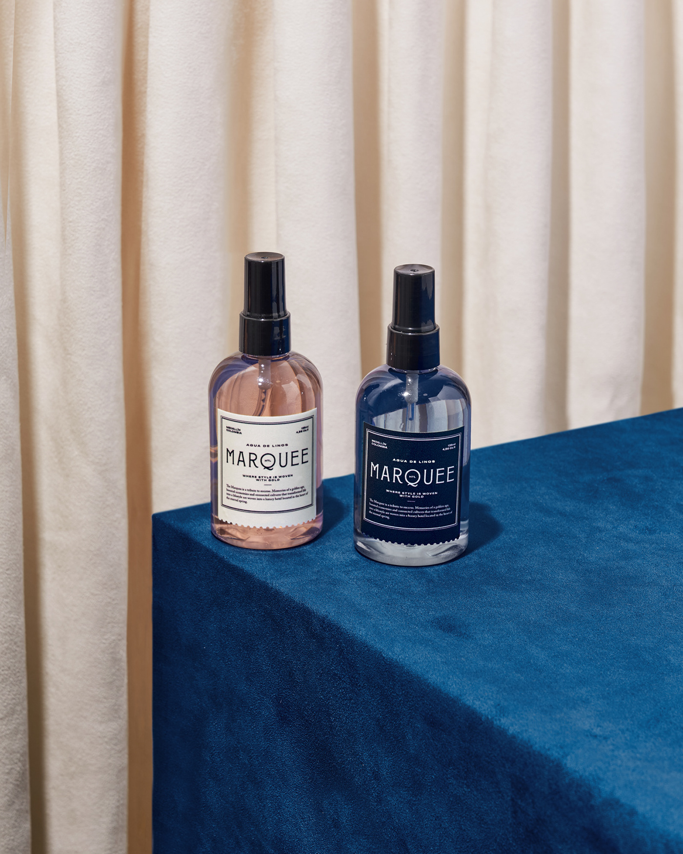
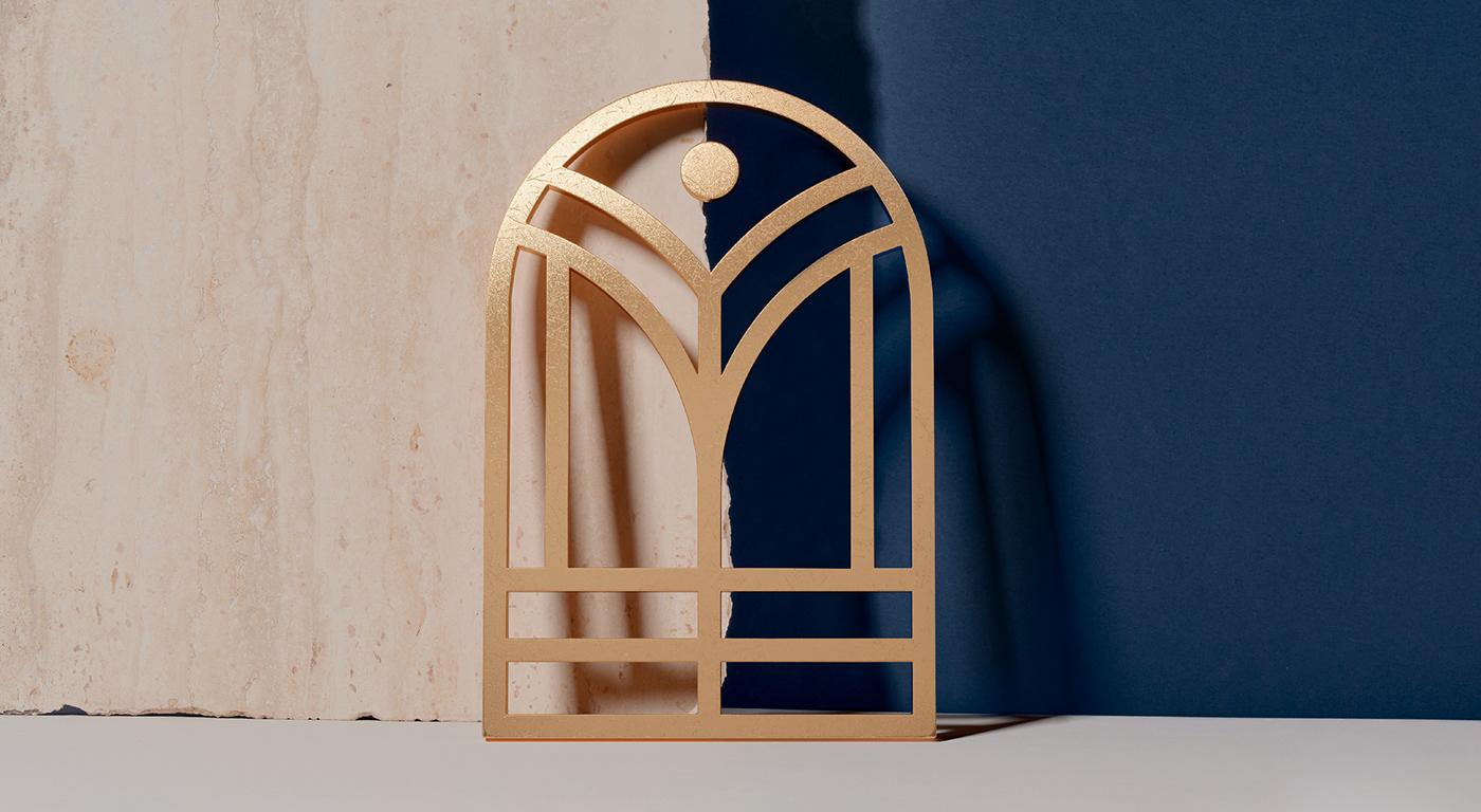
The visual identity of the hotel was mostly inspired by Medellín’s golden age which took its origin from the evolution of the textile industry. The city’s background led us to choose a color palette that includes a blue indigo to evoke denim fabric and a darkened gold to add a more luxurious and sophisticated feeling to it. We also designed a logomark with the initial letter to manifest the meaning of a marquee (roof to protect the entrance of buildings). For the logotype we selected an art deco font and then we modified some characters in order to balance the letter setting while keeping the “Q” at the center.
Fun fact: At its first stages, the name of the hotel was “Índigo”. Due to legal naming issues the hotel changed its name to Marquee. In spite of those circumstances the project kept the significance.
Made by invade.
Interiors: Sandra Pizano / Ricardo Vélez / Marcela Vélez
Architecture: ALH